Netflix users have vowed to unsubscribe to the streaming service over its ‘atrocious’ new user interface (UI).
The popular media platform has been fiercely criticized on social media as its home page layout has suddenly changed – particularly affecting people’s experience while using Netflix on TV.
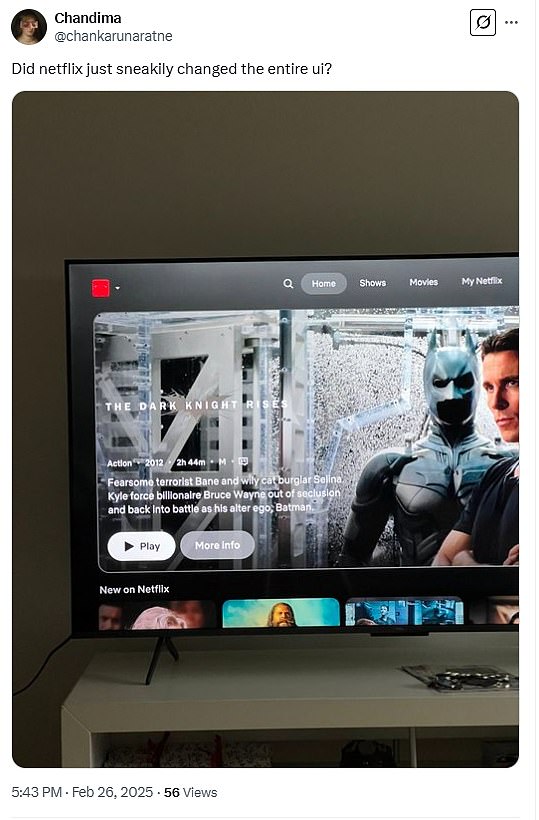
‘Did Netflix just sneakily changed the entire UI?’ one baffled X user captioned a photo of the new design on Wednesday.
While scrolling through content to watch, viewers have noticed several flaws with the unexpected redesign.
The most common complaint on social media has been show options taking up too much space on the screen.
‘@Netflix your new app update sucks. This new UI looks absolutely atrocious. Can only see maybe 30% of what we could see before. May consider unsubscribing just because of this lol,’ one user complained.
‘Nobody asked me but the new @Netflix menu sucks. I hate it. Can’t see anything but one show at a time,’ someone echoed the anti-update sentiment.

Netflix did not announce this sudden change, but they began testing this new design with a select group of subscribers in June 2024

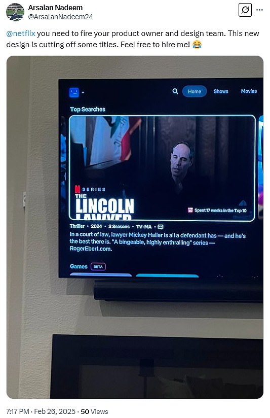
Another person complained that some of the titles of shows and movies look cut off – as if the thumbnail image is too large for the box it is being displayed in.
‘@Netflix you need to fire your product owner and design team. This new design is cutting off some titles. Feel free to hire me!’ they wrote along side a photo of their TV screen.
The image shows the series The Lincoln Lawyer, but the word ‘lawyer’ is not fully visible because of the new UI.
A particularly heated Netflix watcher described the new interface as ‘Slow. Annoying. Dumb. Awful.’
‘@Netflix you’ve now messed up your ui on Roku so badly I may unsubscribe,’ they asserted.
Many people have even begged Netflix to reverse the changes made.
‘@Netflix rollback the UI on the TVs, please, for the love of god. Make it more appealing, we don’t need the shows to take that much screen space,’ someone pleaded.
Many have pleaded for the return of the old layout and threatened to unsubscribe to the streaming service
Netflix did not announce this sudden change, but they began testing this new design with a select group of subscribers in June 2024, The Standard reported.
Senior director of product Patrick Flemming said it was meant to simplify the user experience and minimize people having to do ‘gymnastics they do with their eyes.’
Flemming essentially said that the less options available on the screen, the better – which is quite the opposite of what social media users have described.


