Good morning. ASML, which manufactures tools for semiconductor production, reported a big drop in bookings yesterday. Semiconductor stocks, including mighty Nvidia, fell sharply in response, and the whole market was a bit morose. A blip, or the first chink in the armour of the great AI narrative? You tell us: robert.armstrong@ft.com and ethan.wu@ft.com.
No, higher rates are not (very) inflationary
Here’s a theory that’s been making the rounds. Interest rates are high, and yet growth is strong and may even be accelerating, while inflation is stubborn. So maybe high rates, far from holding growth and inflation back, are stoking them.
The idea is not, on its face, totally crazy. A few economists, notably the modern monetary theorist Stephanie Kelton, have long promoted some version of it. Policy interventions work through multiple channels, so the different effects may point in different directions or vary over time. Perhaps we’ve worked through most of the disinflationary impulse (sleepy M&A, lower rate-sensitive activity, higher financing costs, etc) and are left with the inflationary residue.
Three plausible causal mechanisms have been proposed:
-
Through the frozen housing market. JPMorgan Asset Management’s Jack Manley made this case to us yesterday. He argues that the recent bout of stubborn shelter inflation is being caused by the lock-in effect. Homeowners, holding cheap legacy mortgages, become unwilling to sell their homes. That restricts housing supply and, combined with unaffordable mortgage rates, increases demand in the rental market, thus generating shelter inflation. Until the Fed unlocks housing supply with lower mortgage rates, says Manley, inflation is likely to stay hot.
-
Through rising consumer interest income. All those high-yielding cash accounts have got to mean something. The hedge funder David Einhorn made an argument along these lines in Bloomberg earlier this year, noting that the $13tn in households’ short-term interest-bearing assets exceeds the $5tn in non-mortgage consumer debt. He put the net income stream at $400bn per year.
-
Through rising corporate interest income. As with households, corporate cash hoards now generate meaningful returns.
Let’s take these in order.
On the housing market, we’re willing to believe that high rates could be supporting rental inflation (though more timely rental market measures look less bad than the official data). But we are not convinced that cuts would lower rental inflation. Measures of housing sector demand — from housing starts and construction employment to residential investment and mortgage applications — have looked weak for nearly two years. Whatever boost to existing-home supply might happen would be offset by a pop in demand. Just how those net out isn’t obvious, but given the structural supply shortage in the housing market, our bet is it would be inflationary.
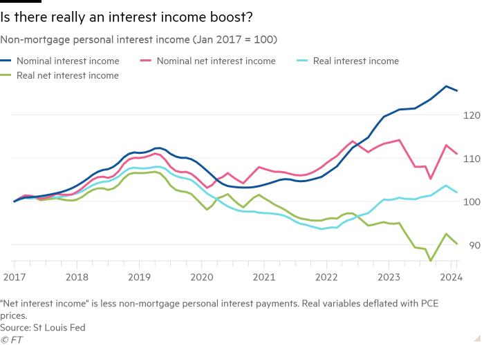
The consumer interest income story is intuitive but ultimately unrealistic. There is no doubt people get paid more interest now (and, if they have fixed-rate mortgages, do not pay much more interest than they did a few years ago). Since rates started rising, the increase in monthly personal interest income is $265bn. That’s a lot! But remember, over the same period, interest expenses and inflation were rising, too. The chart below uses data on non-mortgage consumer interest income from the US Bureau of Economic Analysis. Real net interest income (ie, less interest expense), in green, has fallen since the start of 2022:
There is also something slightly odd about concluding that, because one can earn 5 per cent in a money-market account now, people feel richer. The question is: where was that money before? If it was sitting by itself in a near-yieldless savings account, OK, maybe they do feel richer (though if it hasn’t been moved into a money-market account, they do not feel much richer: average yields on savings accounts have moved from .06 per cent in 2022 to a lordly .46 per cent today). But if the money was part of a cash/bond/fixed-income allocation, returns on that allocation have been awful in the past few years, because of the monstrous year 2022. Do I feel rich because a part of my portfolio that has performed horribly for years now pays a high yield?
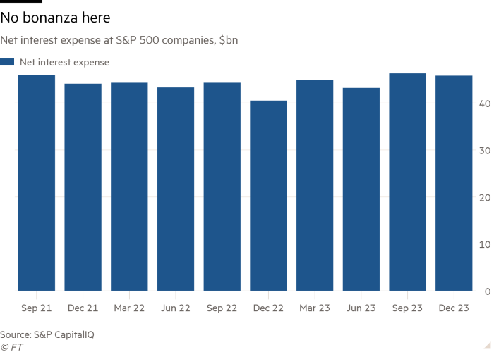
Lastly, business interest income. National accounts data suggests non-financial companies’ net financing costs have fallen 40 per cent since rates began rising, which may suggest rising interest income has been a big offset. Curiously, though, this trend is less clear among S&P 500 companies, which we would expect to have larger cash reserves and more debt fixed at low rates, giving them more to gain from higher rates. But over the past 10 quarters, net interest expense (that is, interest expense less investment income) among S&P companies has been steady and the recent trend is, if anything, up.
This is a question we’ve admittedly only spent a little time considering (readers, weigh in). It’s possible, though far from clear, that higher rates could be having a mildly inflationary effect. But it’s just one factor among many. Growth appears strong for fundamental reasons: a tight labour market, productivity gains, healthy consumer balance sheets outside of the low end. The high-rates-stoking-inflation hypothesis is neither established enough nor big enough in magnitude to sway us or, in any likelihood, the Fed.
The size factor RIP?
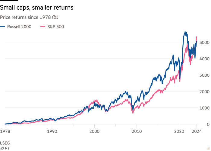
Over at Alphaville, Robin Wigglesworth has written an excellent and thorough piece about how US small cap stocks, depending on how you measure them, have not outperformed US big caps. Those of you who managed to stay awake back in finance school will recall the theoretical consensus was once that small should outperform big over time, either because smaller is riskier and investors need to be paid for that, or because of some ingrained behavioural something or other among investors, or both. This is the “size factor”.
Here’s the incriminating chart:
What happened? It’s not clear, but Wigg has three main ideas:
-
The quality of small cap companies has declined, with lower growth, weaker profits and more fragile balance sheets. Many strong smaller companies have been taken private. And lately, the weaker balance sheets have been exposed by rising rates.
-
Greater transparency and liquidity means there are less undiscovered gems in small cap indices.
-
The Russell 2000 index’s weighting scheme creates frictions that weigh on performance.
All three may be true to a greater or lesser extent. Unhedged has only two small points to add. Factor performance moves in long regimes, as investors in the quality factor have discovered, to their sorrow, over the past 20 years or so. In particular, as factor-investment magnate Cliff Asness of AQR wrote a few years ago, factors can undergo changes in valuation that cause them to over- or underperform for significant periods. These changes can overwhelm fundamental factor performance for a long time. But valuation shifts don’t go on forever. Looking at a 20-year chart of the price/earnings valuations of the S&P 500 and its small cap sibling the S&P 600, it seems possible that this is what has happened to small stocks:
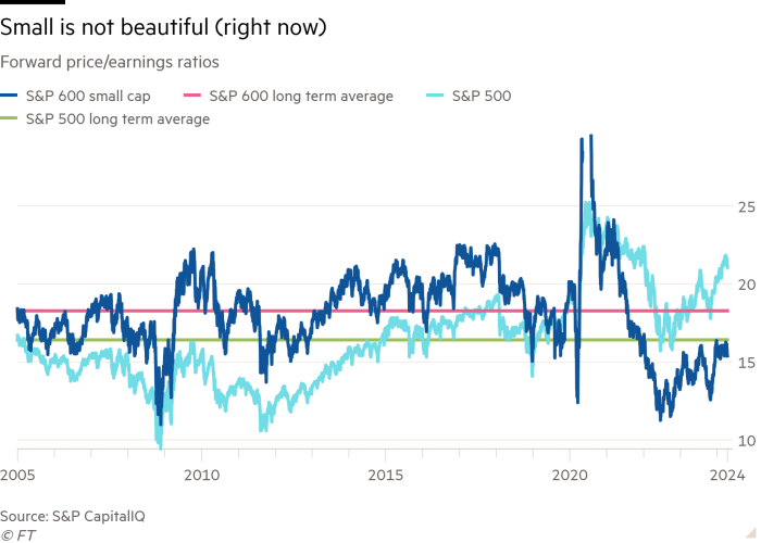
Small caps (dark blue line) once traded at a sustained premium. They lost it five years ago or so, and they now trade at a big discount to both big caps (light blue) and their own long-term average (pink line). Meanwhile, big caps trade way above their own long-term average (green). That goes a long way to explaining Robin’s long-term price return chart. Does the valuation shift have to reverse? Nope. Can the small cap discount keep widening forever? Probably not.
(I should note that Asness does not believe in a size factor per se. He thinks that small stocks have a higher beta — volatility relative to the market — and this, rather than anything about their size, explains why small cap investors get paid more. There is no volatility-adjusted size factor, in other words. But if you do believe that there is a size factor, the above point about valuation shifts still applies).
The second point is closely related. If we grant the idea that small cap companies have become fundamentally weaker recently, that still does not mean they will now underperform big caps forever, or that there never was a size factor. What it does mean is that their valuations have to adjust to the new fundamental reality. That could be what is happening in the p/e chart above. That would not necessarily signal the death of the size factor.
One good read
Sport gambling is proliferating in the US. So expect to see more of this.
FT Unhedged podcast
Can’t get enough of Unhedged? Listen to our new podcast, hosted by Ethan Wu and Katie Martin, for a 15-minute dive into the latest markets news and financial headlines, twice a week. Catch up on past editions of the newsletter here.


