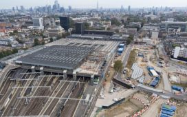
The near quarter-century, kilometre-long, 67-acre project to redevelop King’s Cross in London is a monument of its age. It is the urban embodiment of the Blair era in which it was conceived, of the third way, of the idea that market forces, wisely guided by light-touch government, can be a power for good. It will get into the history books about cities (if such things are written in the future), representing its time in the same way that John Nash’s Regent’s Park represents the Regency and the Barbican represents the 1960s.
The architects of its masterplan, Allies and Morrison and Demetri Porphyrios, have now submitted it for this year’s RIBA awards programme, which could get it on to the shortlist for the Stirling prize. This means that, although there is construction still to be done, not least on the Google headquarters, they consider the essential concept of the masterplan complete. Cadence, a residential building by Alison Brooks Architects, which occupies a culminating point at one end of the site, is also, bar some snagging, finished. Somewhat shockingly, of more than 30 practices commissioned on the site, Brooks is the first one with a woman’s name in its title.
The development runs from the terminuses of St Pancras and King’s Cross through a central open space called Granary Square, to a dense cluster of blocks and towers at its northern end, formed around a long oblong lawn with Brooks’s building at its head, which includes most of the most recent additions. It is phenomenally successful, both commercially and at achieving its stated aims. Its developers, Argent (selected in 2001), set out to achieve somewhere like the sort of cities where you might want to go on holiday, with open spaces that one of its architects calls “incredibly pleasant”, and – contemplating children from surrounding areas playing in its fountains, or office workers and art students lounging in its open spaces – it has certainly done that. It has created, in its 50 new and restored buildings, about 1,700 homes, more than 40% of them affordable, 30 bars and restaurants, 10 new public parks and squares, 4.25m sq ft of offices and capacity for 30,000 office jobs.
Criticism of its architecture therefore comes into the category of “wouldn’t it be good if” rather than fundamental renunciation of its approach. Yet it provokes a hard-to-define feeling that there is something missing. For some this may be a lack of urban grit, but it is difficult and a little absurd to design this quality into new buildings. It’s more that the development seems nervous of its own boldness, and averse to conflict and tension. Opportunities for drama, for the push and pull of old and new or high and low, are largely played down.
The character of the new work is set by a combination of ambition and negotiation. This area was created by brutal industrial businesses, which built railways and canals and warehouses that couldn’t care less for whoever might have been living there, or environmental impact or conservation or public space. It created blunt structures such as the multilevel food distribution centre called the Granary and a celebrated array of gasholders that in their time towered over their surroundings. Today’s capitalism produces structures several times larger, office blocks and apartment buildings that make the industrial heritage look almost petite, yet they aim to downplay their scale.
The ambiguous quality of the development comes from the circumstances of its conception. The opportunity to build big arose largely from the consolidation of land for the purposes of building the Channel tunnel rail link into St Pancras station. At the same time the site included a complicating array of listed buildings, and the local community a number of vociferous objectors. When permission was granted, in March 2006, it was only after a planning meeting lasting into the small hours, and by a narrow margin.
The architects proposed no grand vision. Their plan didn’t have design codes – the device by which consistency and uniformity are sometimes imposed on large developments. Instead, an irregular layout of streets and squares was produced that took its cues from patterns already on the site – the streets crossing from side to side, the canal that winds across it, the historic structures. Architects of individual buildings were given “parameter plans” that gave a general indication as to how they were to relate to their neighbours and fulfil what Allies and Morrison call their “duty to contribute to the greater whole”.
The masterplan is based on “picturesque” principles derived from the theories of Camillo Sitte, a 19th-century Austrian planner who admired such things as the way in which a church tower might come into view along a winding medieval street. The idea is to create a place where you are “invited” through from one space to another, where all the parts interconnect, and where buildings are less important than the spaces between them, and where the boundaries with surrounding areas are blurred, such that the development might feel like a continuation of the rest of the city rather than a place apart.
The result is a set of contrasting spaces that cover the site from one end to the other: a long boulevard running from the train stations to the centre of the site; an inward-looking square to one side, then a more open piazza in front of the Granary; then that long oblong lawn framed by buildings rising up to 15 storeys, which heads towards the farthest end. Smaller courts and streets perforate the blocks to the side of this central progression.
after newsletter promotion
It is all good and successful, and an understandable reaction to the failures of more assertive planning. There are buildings of various degrees of handsomeness along the way. But there’s a strangeness that comes from dissembling the new buildings’ might; from treating multistorey blocks as if they’re street houses in a delightful old European town, which they are not. It wouldn’t hurt if one or two spaces were more decisively shaped, and if there were the occasional set piece of the kind that Nash would have laid on.
The new buildings also display some uncertainty at ground level. There are shops and food outlets, and there are pavements that sometimes carry outdoor seating, parasols and planters, that are well-enough used, but often there’s nothing particularly pleasurable or intended about the relationship. The streets and open spaces in the newer, more northern blocks feel diagrammatic. There is in general a reluctance to let things be fully what they want to be, whether a thumping big building, or an industrial relic, or a pavement cafe. This possibly comes from a de-risking attitude – with many hazards in the realisation of the project, the developers may not have wanted to take too many chances with the architecture.
Alison Brooks’s building, standing at the end of a long vista, offers some of the vivacity that other buildings lack. It consists of a conjoined pair of red brick towers, one tall and central, the other off-centre and angled away from the prevailing right angles, with jiggered rhythms of windows and recessed balconies. Irregular arrays of arches appear at top and bottom, and at one or two places halfway up, that follow not purely circular Bézier curves, which have an ancient-futuristic, Saharan-Star Wars feel. They have a mannered bounciness, palpably not carrying much weight. In the foyers and on some of the upper floors, arches extrude into vaults, which with the twists in the plan and a small courtyard create intriguing layers of inside and outside space. It’s not that every building need be as complicated as this, but it brings a welcome sense of adventure.
King’s Cross has undergone a 180-degree turn from a place of dirt and danger, notorious for drug use and sex work, to one of cleanliness and safety. There are those who mourn the loss of the rackety creativity and cinematic excitement that went with the old version, but, short of designating crime as a cultural heritage asset, it’s hard to know how that character could be kept. Places change, and the incredible pleasantness of which Allies and Morrison speak is no small achievement. I’d only wish that in its latest transformation King’s Cross had as much personality as in previous iterations.


